From Fear to First Call: How to Build a High-Converting, VOB-Optimized Landing Page
Most BH landing pages lose patients before the first call. How to design a VOB-optimized page that converts fear into action — and inquiries into admits.
Key Takeaways
- A high-converting BH landing page lowers the psychological cost of reaching out and removes the financial uncertainty that stops people from calling.
- VOB optimization is a trust signal, not a technical feature — make insurance the front door, not the fine print.
- Lead with the visitor’s problem, not your accreditations; a landing page is not a brochure or a homepage.
- Real coordinators, therapists, and authentic testimonials drive 1–2x conversion lifts over generic branding.
- Moving a page from 2% to 6% conversion can more than triple admissions from the exact same media spend.
Most behavioral health landing pages are built around what the facility wants to say — leading with accreditations, amenities, and a generic “start your journey” headline. The person who landed there — usually terrified, often financially anxious, sometimes in acute distress — bounces before they ever reach the phone number.
That is an admissions problem, not a traffic problem. A high-converting BH landing page does two things well: it lowers the psychological cost of reaching out, and it removes the financial uncertainty that stops people from calling.
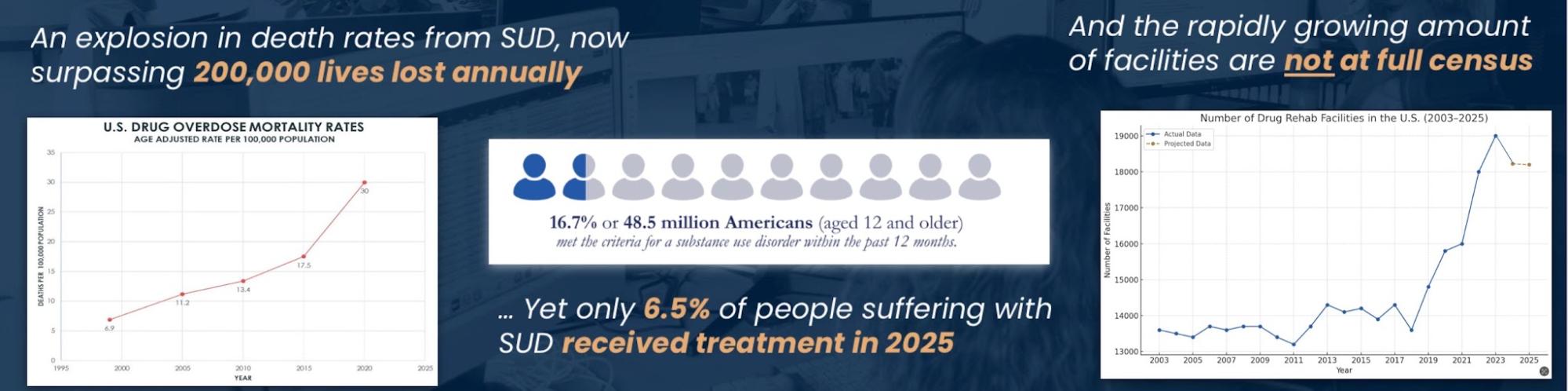
VOB optimization is not a technical feature. It is a trust signal. When someone can immediately see their insurance may cover treatment, the perceived barrier to calling drops significantly.
This article covers how to structure a landing page that does both — useful for the marketing and admissions teams who need to close the gap between a click and a call.
Understand What Your Visitor Is Actually Experiencing
Before you write a word of copy or place a single element, understand the emotional state of the person you are designing for. Research consistently suggests that individuals seeking addiction or mental health treatment face significant barriers beyond logistics — stigma, shame, fear of cost, and uncertainty about what happens next, all present at the moment of search1.
That person is not browsing. They are looking for a reason to trust you enough to call. Every design decision on the page either supports that trust or erodes it.
Accreditation logos, facility photography, and program overviews all have a place — but they are not the lead. Lead with the visitor’s problem, not your solution.
Headline and Above-the-Fold: Earn the Scroll
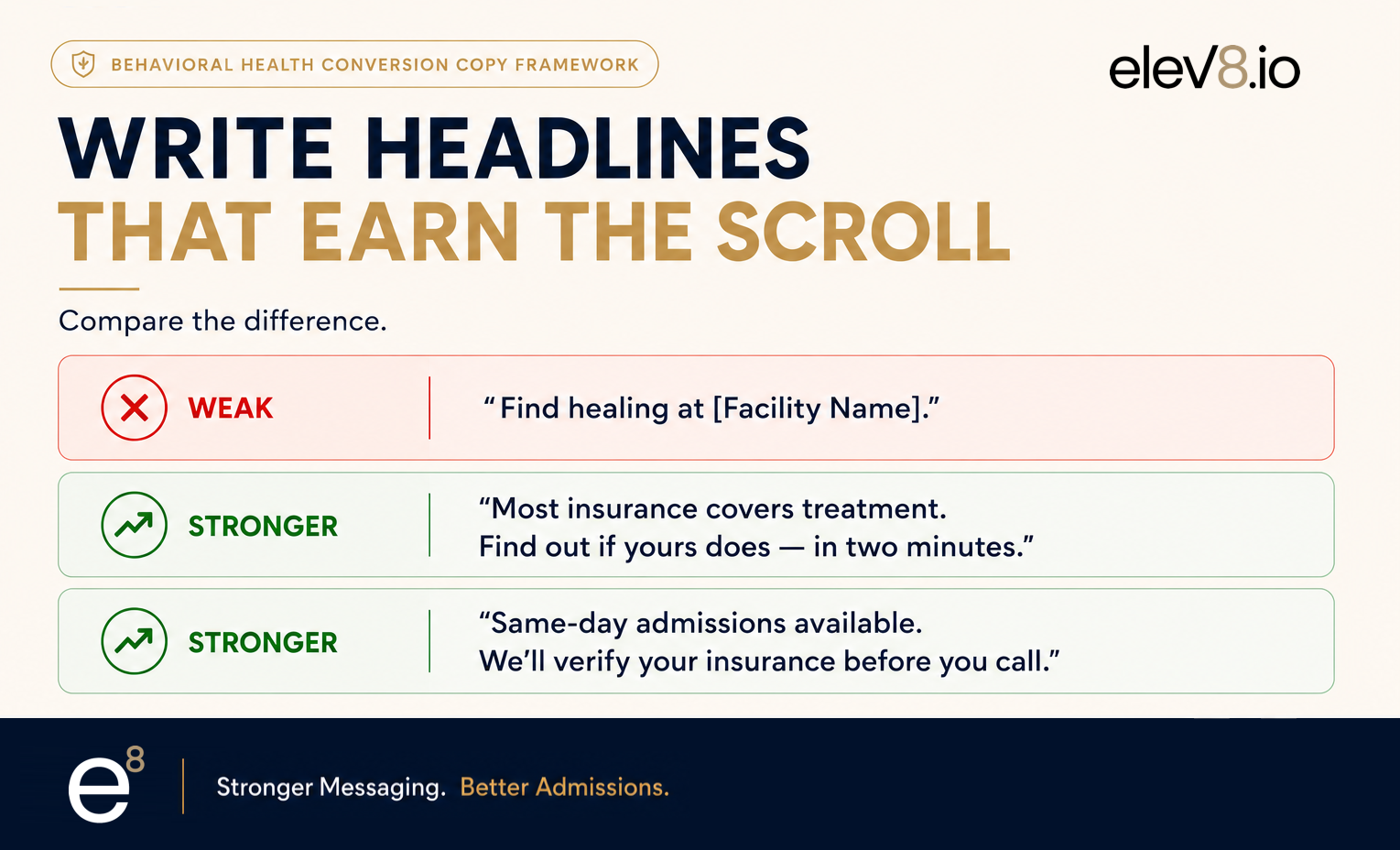
The headline is not a tagline. It is a statement that tells the visitor they are in the right place. Effective BH headlines tend to do one of three things: acknowledge the situation directly, speak to the most common fear (cost, judgment, or what happens next), or promise a specific next step. Generic headlines such as “Compassionate care starts here” or “Begin your recovery journey” do none of these. Compare:
Above the fold, you need the headline, a subheadline that adds specificity, a primary CTA (phone number or form), and a brief insurance acknowledgment. Everything else goes below. Do not compete with yourself by filling the viewport with imagery and navigation options.
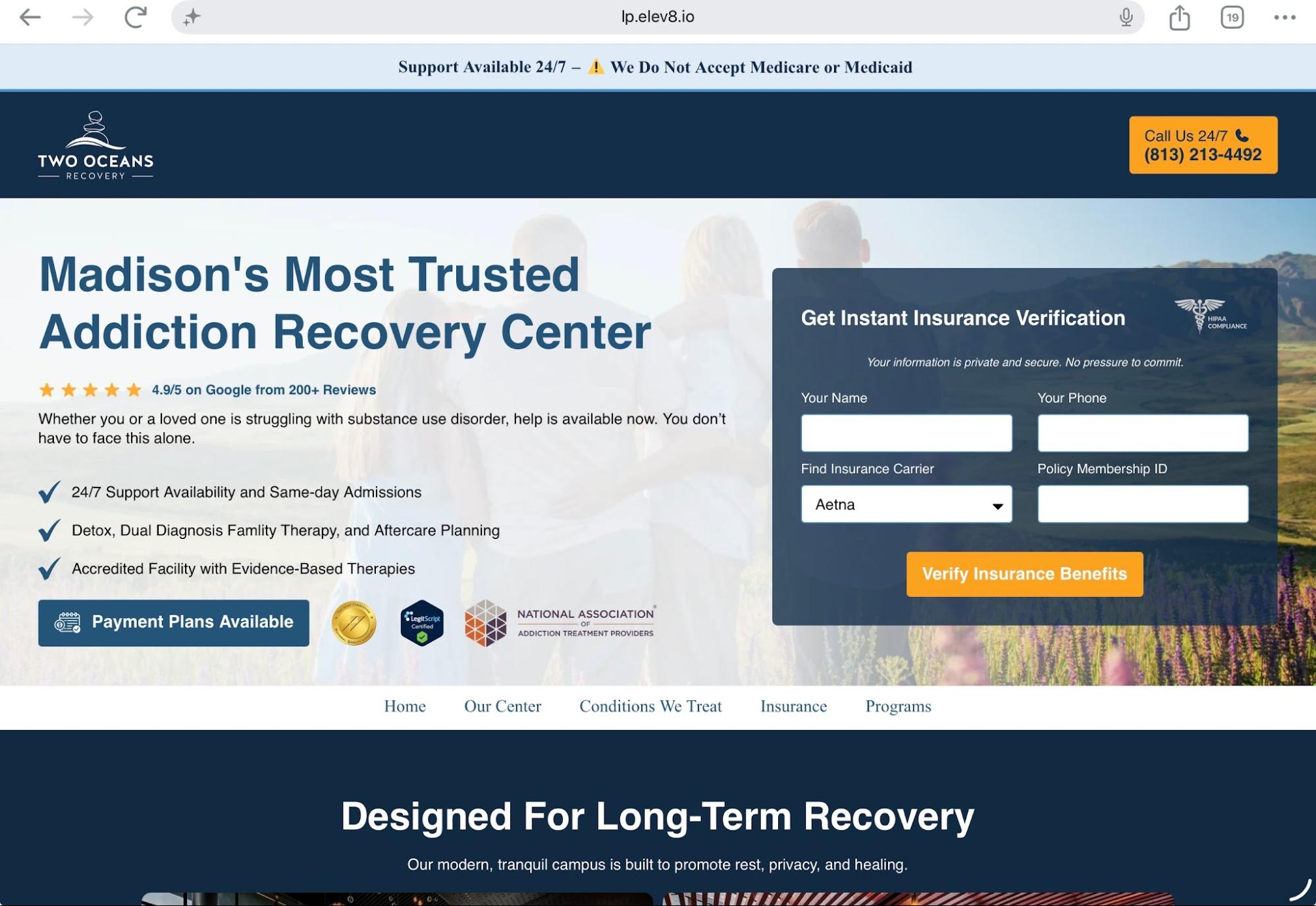
Sample High-Converting Behavioral Health Landing Page
The example below showcases a concept for a behavioral health landing page designed in collaboration with Clint Mally and the team at Recovery.com, originally presented at the Recovery Marketing Summit 2025.
Built using the elev8 and Recovery.com collaborative 16-point behavioral health landing page optimization checklist, this page was engineered around key conversion principles, including:
All these features are designed to maximize qualified admissions opportunities from paid media traffic. For additional context and best practices, visit this article2.
VOB Optimization: Make Insurance the Front Door, Not the Fine Print
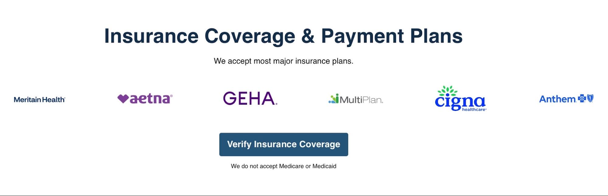
Cost is the most cited non-clinical barrier to treatment entry1. A visitor who does not know whether their insurance covers your program will not call to find out. They will leave and look for a facility that answers the question upfront. VOB optimization on a landing page is about removing the uncertainty that prevents the first contact.
What an Optimized VOB Experience Looks Like
Landing pages that surface insurance information in the above-the-fold section and include a short VOB form consistently outperform brochure-style pages on cost-per-contact.
Reducing Psychological Friction Across the Page
Every section of the page either reduces or increases the cost of calling. Most facilities underestimate how much friction accumulates in the body of the page.
Process Transparency
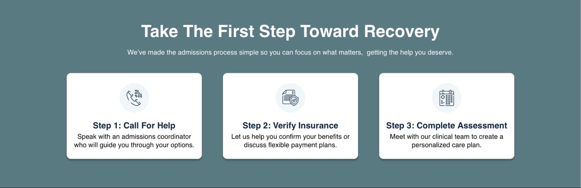
One of the most effective conversion elements is a simple, numbered “what happens next” section. Fear of the unknown is a primary barrier to first contact. Showing someone that Step 1 is a confidential call, Step 2 is a benefits check, and Step 3 is a clinical assessment demystifies the process. Keep this to three or four steps — the goal is to eliminate dread, not provide a program overview.
Social Proof That Is Actually Credible
Generic five-star reviews from anonymous sources do not move BH visitors. Credible social proof in this category is specific and human: it names what the person was afraid of and what happened when they called. Format it as a short quote (two to three sentences), a first name and general location, and — where permitted — the type of program attended. Never fabricate. Never imply outcomes that cannot be guaranteed. Always comply with relevant testimonial guidelines and obtain proper consent.

Admissions Team Humanization
Showing a photo of a real admissions coordinator — with a name, a brief bio, and a direct quote — can reduce the perceived coldness of the intake process. The person about to call is imagining who will answer. Give them something reassuring to imagine. This is not a design flourish; it is a conversion element.
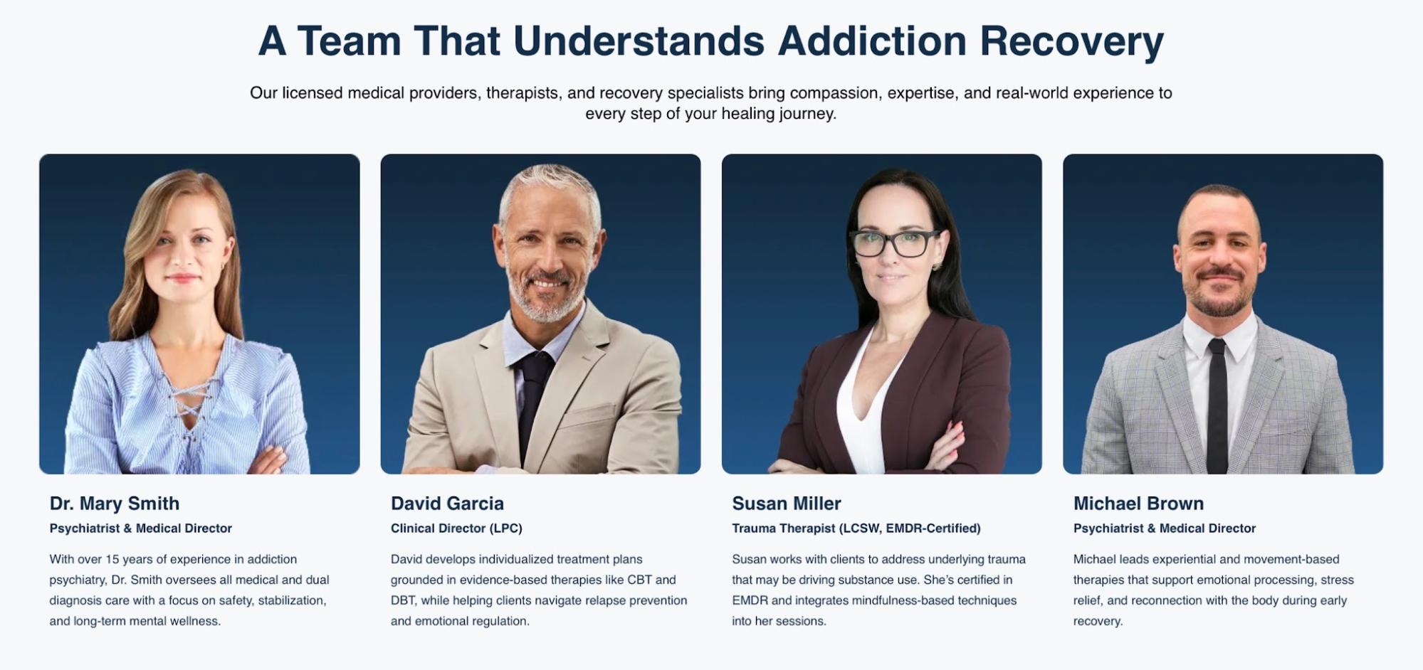
At elev8, we have consistently seen meaningful lifts — 1–2x in conversion rates — when behavioral health organizations replace generic branding with real human connection. Featuring actual admissions coordinators, therapists, and care teams, supported by credentials, experience, staff profile pages, and authentic patient testimonials, helps reduce fear, increase familiarity, and build trust before the first call ever happens.
In behavioral health, people rarely connect with logos or marketing slogans alone. They connect with the people who are going to help them transform their lives. The more transparent and human the experience feels, the more likely that prospective patients and families will engage, trust, and reach out for help.
How much spend is your landing page leaking?
We pressure-test your hero, VOB flow, and CTA architecture against cost-per-admit.
CTA Architecture: More Than a Button
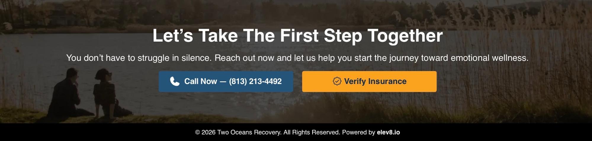
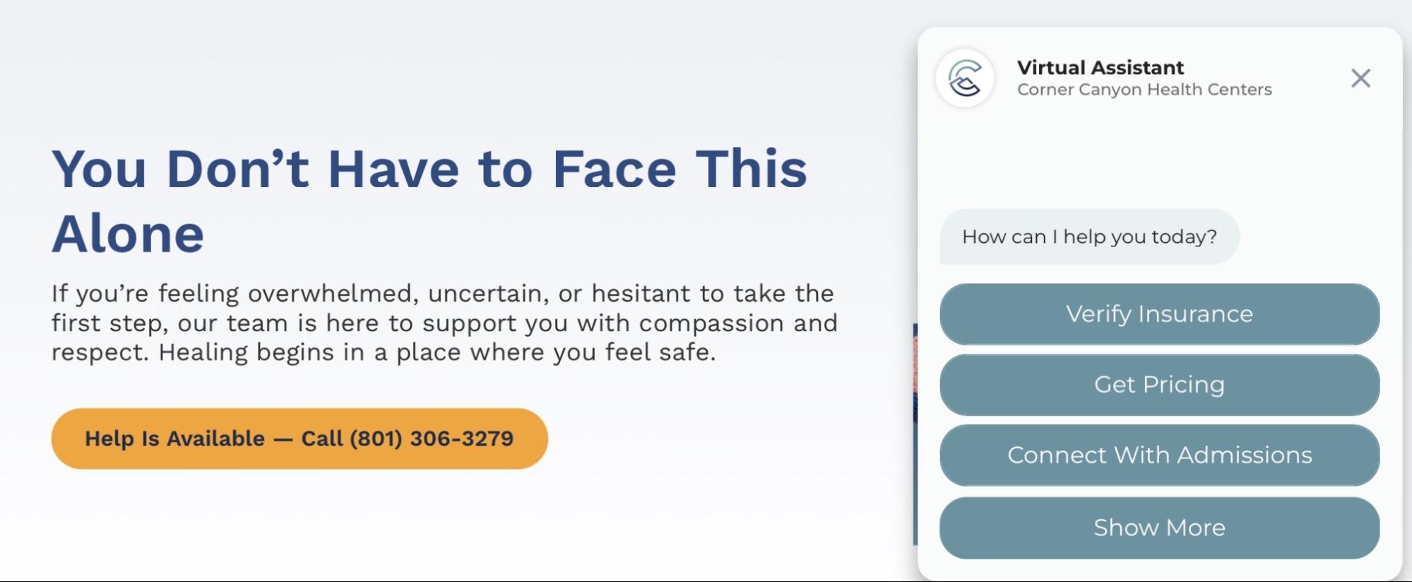
Most BH landing pages have one CTA strategy: a phone number, repeated several times. That is necessary but not sufficient. A well-architected CTA strategy accounts for the different readiness levels of visitors on the same page. Some people will call immediately; others need a lower-commitment entry point. Build both.
What a High-Performing BH Landing Page Is Not
The Admissions Funnel Starts Before the Call
Facilities spend heavily to drive traffic, but they often underinvest in what happens after that traffic arrives. The landing page is where marketing spend either pays off or evaporates. A page that converts at 6% instead of 2% can dramatically reduce effective acquisition costs without increasing ad spend by a single dollar.
At elev8, we frequently inherit paid media campaigns across Google Ads, Microsoft Ads, Meta Ads, and Recovery.com Ads, where landing page conversion rates sit in the low single digits. Often, the traffic itself is not the problem — the post-click experience is. A small increase in conversion rate can create a disproportionate impact on admissions economics.
Consider a common scenario with a client facing a competitive Google Ads environment and an inadequate CRO process to support the ad investment:
Their landing page was converting calls at just 2%, generating roughly 50 leads. Applying common behavioral health admissions benchmarks:
The difference between a 2% and a 6% conversion rate is often the difference between barely breaking even on paid acquisition and creating a sustainable, profitable growth engine — one that lets organizations confidently reinvest in more marketing, staffing, and expansion.
This is why VOB optimization, friction reduction, CTA architecture, page speed, trust-building, and admissions psychology are not simply “web design decisions.” They are part of your admissions strategy2. The facilities that understand this distinction consistently outperform organizations that treat landing pages as static deliverables instead of revenue-generating systems.
Never let your ads write checks that your landing pages can’t cash.
At elev8, we build and optimize landing pages as part of a complete admissions funnel audit. We analyze what happens from the first click to the completed admission — identifying where friction, confusion, distrust, or operational bottlenecks are causing drop-off and lost revenue. VOB optimization, friction reduction, and CTA architecture are not design choices. They are admissions strategy.
Recovery.com Endorses elev8’s Landing Page Strategy
During the 2025 Recovery Marketing Summit, Recovery.com endorsed elev8.io as their preferred landing page conversion rate optimization partner in this short video.
Sources

VP, Marketing Operations · elev8.io
Elizabeth Navas is VP of Marketing Operations at elev8.io, where she leads the execution and optimization of growth strategies for behavioral health organizations. She oversees the teams, systems, and processes that align marketing, admissions, CRM, and operational performance to help clients achieve sustainable census growth.
Known for her technology-driven and results-oriented approach, Elizabeth specializes in turning strategy into execution, ensuring every initiative is measured, optimized, and aligned with business objectives. Her expertise spans marketing operations, patient acquisition, CRM optimization, reporting, and performance management, helping behavioral health organizations build scalable systems that drive long-term success.